
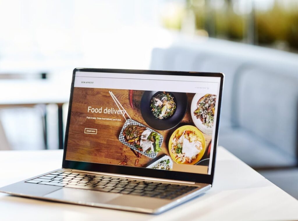
Your menu is the heart of your restaurant, and online it works even harder than the printed version. A well-crafted restaurant menu website design can turn a casual visitor into a paying customer in seconds, while a confusing one will send them straight to a competitor. In this step-by-step guide, we’ll walk restaurant owners and designers through the layouts, typography choices, mobile patterns, and live examples that make digital menus truly appetizing in 2026.
Why Your Online Menu Page Matters More Than Ever
According to recent hospitality studies, more than 80% of diners check a restaurant’s website before deciding where to eat, and the menu is the single most visited page. If your menu loads slowly, hides prices, or breaks on mobile, you’re losing reservations before the conversation even starts.
A great menu page should accomplish three things:
- Inform visitors about dishes, prices, and dietary information
- Seduce them with imagery, descriptions, and atmosphere
- Convert them into bookings, orders, or visits
Step 1: Choose the Right Menu Layout Structure
Before opening your design tool, decide on the structural approach that fits your concept. Here are the four layouts that perform best today:
| Layout Type | Best For | Pros | Cons |
|---|---|---|---|
| Single-column list | Fine dining, bistros | Elegant, easy to scan | Limited visuals |
| Two-column grid | Cafes, brasseries | Balanced, classic feel | Tricky on mobile |
| Card-based gallery | Burgers, pizza, fast casual | Highly visual, modern | Needs quality photography |
| Tabbed / sticky navigation | Large menus, multi-section | Fast access to categories | More complex to build |
Our Recommendation
For most restaurants, a hybrid layout wins: a sticky category navigation at the top (Starters, Mains, Desserts, Drinks) paired with a clean two-column or card layout below. It gives users speed and visual appeal at the same time. Striking that balance between structure and visual appeal is exactly the kind of thing a graphic design studio does day in, day out.
Step 2: Master Typography for Readability
Typography is where most restaurant websites fail. Cursive fonts on a wine list might look romantic in Figma, but they’re unreadable on a phone in low light.
Typography Rules That Actually Work
- Use a maximum of two fonts: one display font for headings, one neutral sans-serif or serif for body text.
- Body size of 16px minimum on desktop, 17 to 18px on mobile.
- Line height between 1.5 and 1.7 for menu descriptions.
- Contrast ratio of at least 4.5:1 between text and background (WCAG standard).
- Keep dish names bold and prices aligned to the right or directly under the name.
Font Pairings That Feel Like the Right Restaurant
- Fine dining: Playfair Display + Inter
- Italian trattoria: Cormorant Garamond + Lato
- Street food / casual: Bebas Neue + Open Sans
- Cafe / brunch: DM Serif Display + Nunito
Step 3: Design for Mobile First
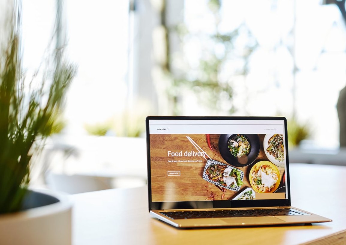
Over 70% of restaurant menu views in 2026 happen on smartphones, often while diners are walking nearby or sitting at the table. Your menu must feel native on small screens.
Mobile Menu Checklist
- Sticky category tabs that scroll horizontally
- Tap targets of at least 44×44 pixels
- Lazy-loaded images to keep loading under 2 seconds
- Collapsible sections for long menus
- One-tap actions: “Order Now”, “Reserve”, “Call”
- No PDF menus, ever (Google penalizes them and users hate pinching)
Step 4: Write Descriptions That Sell
A menu item is not just a label. Compare:
Weak: “Chicken sandwich – $14”
Strong: “Buttermilk Fried Chicken Sandwich – crispy thigh, house pickles, smoked aioli on a toasted brioche bun – $14”
Studies in menu engineering show that descriptive items sell up to 27% more. Keep descriptions between 12 and 25 words, mention origin or technique when relevant, and flag dietary info with clear icons (V, VG, GF).
Step 5: Add Smart Visual Hierarchy
Guide the eye to your most profitable dishes using:
- Boxed “Chef’s Picks” with a subtle background color
- Badges like “New”, “Signature”, or “Seasonal”
- Larger photos for high-margin items
- Whitespace around premium dishes to make them feel exclusive
Avoid currency symbols when possible (writing “24” instead of “$24”) since research shows it reduces price sensitivity.
Step 6: Make It Searchable and Filterable
For menus with more than 30 items, add filters: vegetarian, vegan, gluten-free, spicy, under 15, kids-friendly. A small search bar can dramatically improve UX for large menus and is now expected by younger diners.
Real-World Examples of Excellent Restaurant Menu Website Design
1. Noma (noma.dk)
Minimalist single-column layout with serif typography. The menu reads like a poem and matches the brand’s high-end identity perfectly.
2. Sweetgreen (sweetgreen.com)
Card-based grid with vibrant photography, dietary filters, and instant customization. A masterclass in modern fast-casual menu UX.
3. Dishoom (dishoom.com)
Tabbed navigation with storytelling descriptions. Each section feels like turning the page of a beautifully designed book.
4. Pizzeria Bianco (pizzeriabianco.com)
Proof that a tiny, text-only menu can feel iconic when typography and spacing are perfect.
5. Eleven Madison Park (elevenmadisonpark.com)
Subtle animations, beautiful serif headings, and a clear booking call-to-action right next to the menu.
Common Mistakes to Avoid
- Linking to a downloadable PDF instead of a real HTML menu
- Hiding prices (it makes users bounce)
- Using stock food photos that don’t match what you actually serve
- Forgetting to update seasonal items, leaving outdated content live
- Skipping schema markup for menu items (it boosts SEO significantly)
SEO Tips for Your Menu Page
- Add Menu schema (schema.org/Menu) to help Google understand your dishes
- Use unique meta titles like “Lunch Menu – [Restaurant Name], [City]”
- Include location keywords naturally in dish descriptions
- Compress images to WebP format for faster Core Web Vitals
- Add alt text to every food photo
Bringing It All Together
A great restaurant menu website design is the meeting point between brand storytelling, usability, and conversion. Start with a clear layout, choose typography that breathes, design for mobile first, write descriptions that make mouths water, and study the masters listed above. Your online menu is open 24/7, so make every pixel count.
At Sunshined, we help restaurants transform their menu pages into their highest-performing marketing asset. If you’re ready to redesign yours, get in touch and we’ll cook something delicious together.
FAQ: Restaurant Menu Website Design
Should I use photos for every dish on my menu?
Not necessarily. High-end restaurants often skip photos to keep an elegant feel, while casual concepts benefit from visuals. If you do use photos, they must be professionally shot and represent the actual dish.
Is a PDF menu acceptable in 2026?
No. PDF menus are bad for SEO, accessibility, and mobile users. Always build your menu in HTML.
How often should I update my online menu?
At minimum every season, and immediately whenever prices, ingredients, or availability change. An outdated menu damages trust.
What’s the ideal length for a dish description?
Between 12 and 25 words. Long enough to evoke the dish, short enough to scan on mobile.
Do I need a separate page for lunch, dinner, and drinks?
If each menu has more than 15 items, yes. Separate pages improve SEO and make navigation cleaner. For smaller menus, tabs on a single page work great.
How much should a custom restaurant menu website cost?
Quality custom designs typically range from 2,500 to 12,000 depending on features like online ordering, reservations, and multi-language support. Template-based solutions can start much lower but offer less differentiation.